Periodically, I will post pictures of works of art that I have acquired, or that otherwise pass through my hands or in front of my camera lens. This will be partly to share images and ideas and presentations I find meaningful, and partly to serve as reference points for talking about topics related to art and aesthetics. I will start with two artists whose works I have started collecting in the past year. The first, as alluded to in the previous post, is Raphael Fodde. (The second will be Virginio Ferrari, later this week or early next.)
Raphael is a printmaker in New York, but he draws and paints as well. He has also been a publisher (of fine press books and prints) and a printmaking instructor. I have seen only his printed works in person, though the artistic printmaking process almost always involves various forms of either drawing or painting, or both. Chemistry (or perhaps, alchemy?), for inks and etching solutions, and detailed craftsmanship are intrinsic; and in the case of intaglio printing, serious machinery and the application/harnessing of large physical force also come into play. Especially when the paper is very fine (Japanese tissue, for instance), there is an exquisite juxtaposition of delicacy and muscularity that must be carefully orchestrated and deftly executed. To me, printmaking—what I understand of it—is all of polymathic, multi-disciplinary, and esoteric. Or, in a word, sublime.
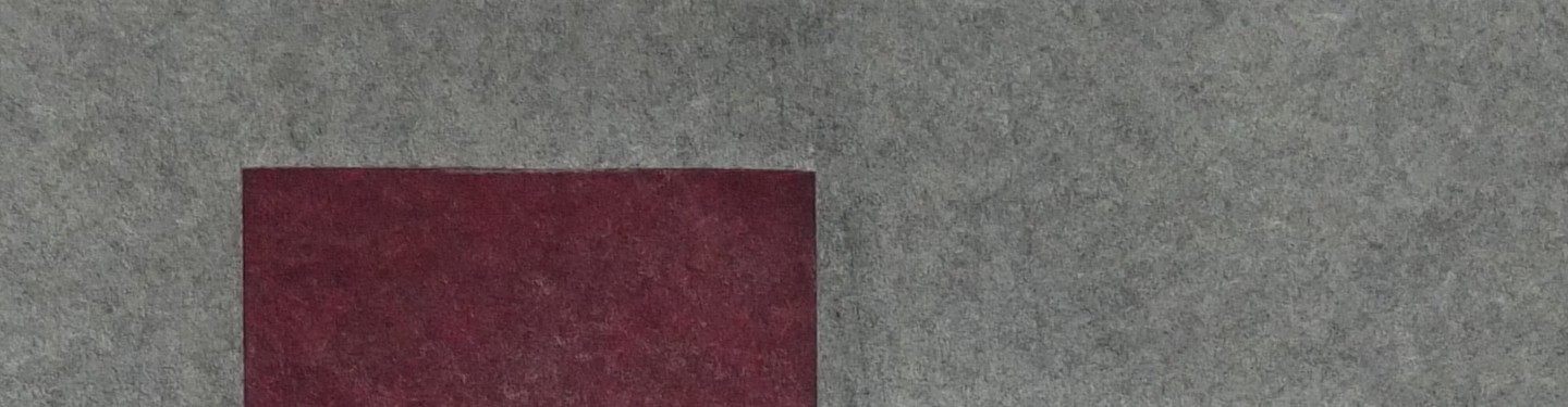
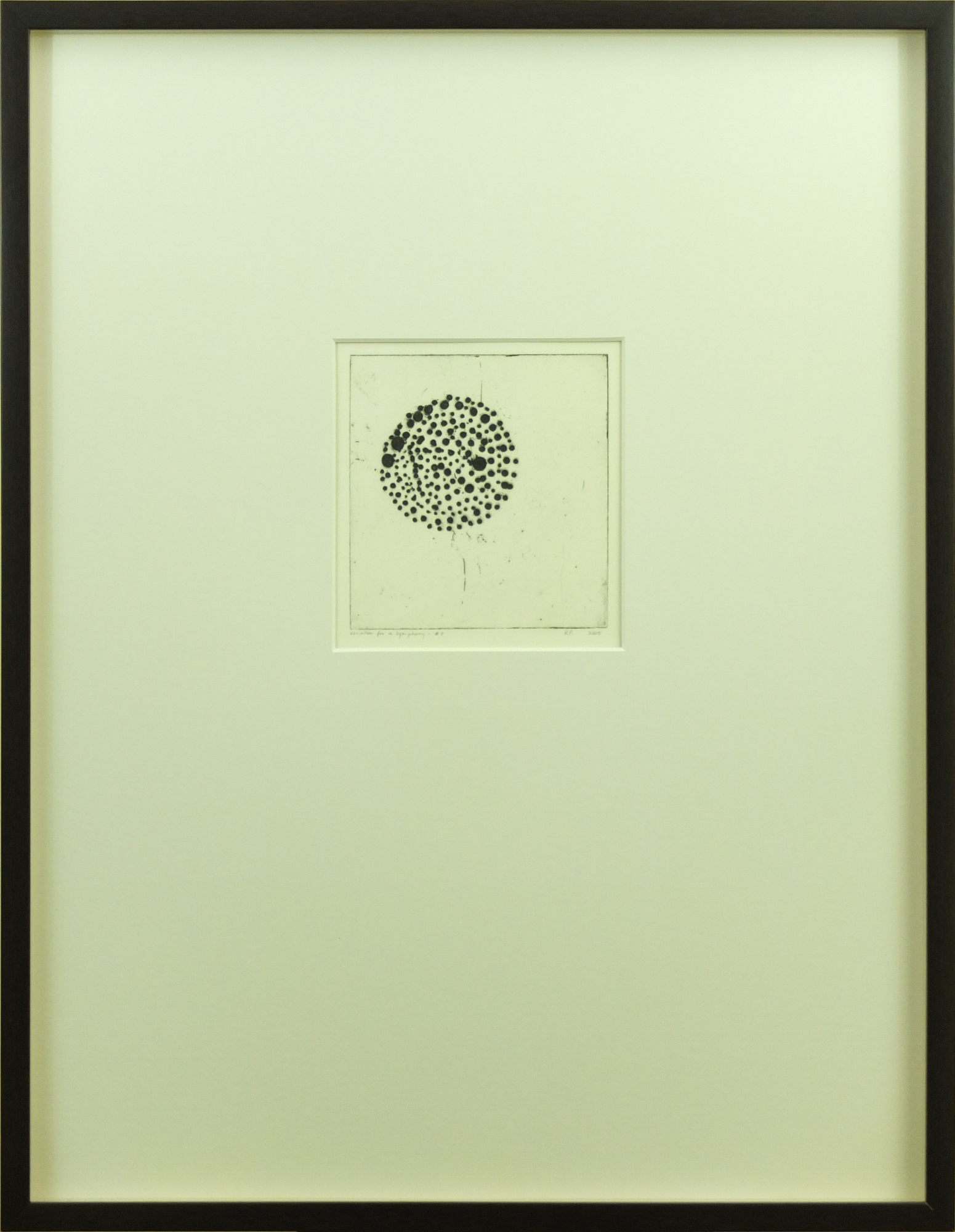
Here are two sugar lift etchings done by Raphael at the Rochester Institute of Technology during an invited visit in 2005 (you can look up details about the technique on the internet, noting that Wikipedia’s description is currently pretty darn weak). The first print, entitled “Variation for a Symphony #7”, is the seventh in what appears to be a limited open-ended edition (you can figure out what I mean by that); I believe that ten pieces, or perhaps just a few more, have been printed to date (my friend Celeste has #10).
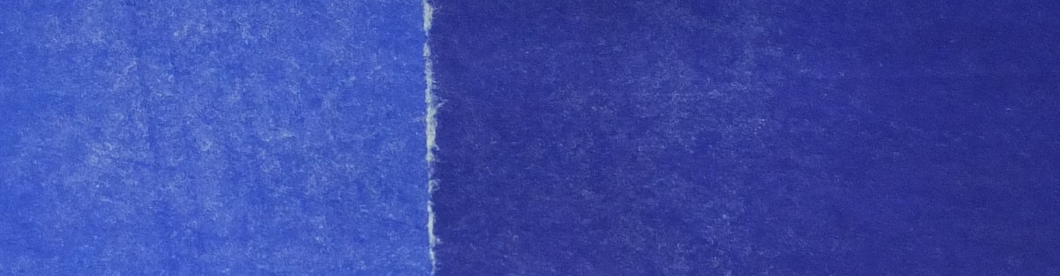
The second work is untitled, from an edition of six.
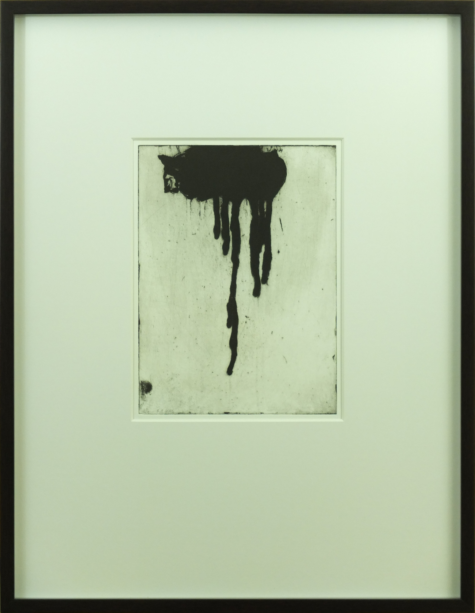
I love that the two images, from the same period and venue, and using the same etching process, are both so striking, yet very different from each other. The first one is orderly and restrained, and there is a soft velvety feel to the small round shapes. The second one is organic and freer, and the larger shape is matte and unfathomable, like a cat with its back turned toward you. Both pieces have great toning and other artifacts from the plate, and the platemarks are delineated awesomely, in ink as well as in impressure.
There are a few topics I want to introduce and discuss in the context of these two pieces. The first topic has to do with matting and framing (note that I generally choose all of the frame moldings, mats, dimensions, etc. for works on paper that I acquire, and do all of the assembly myself, other than frame construction). You will notice that the frames are unexpectedly large for these prints, especially the “Variation” print. There are several reasons for this.
The first reason is for coherence. The frame are, in fact, the same size (23 x 30 inches). And furthermore, they are the same size and molding as for another piece as well (by Virginio Ferrari), which I will present later. For me (and this is purely personal), these three pieces are familially related, though (as you will see) not equilaterally. Putting them all in the same frame embodies this connectedness to me, whether they are situated near each other or not.
The second reason is to preserve the integrity of the paper. Both are printed on large sheets of high quality art paper (possibly Arches?), with nice deckle edges. For different reasons, I have chosen to mat the prints, rather than float them full-sheet. The larger frame allows them to be matted without having to trim the sheets, which would be a shame and a disrespect. The smaller print (“Variation”) was actually printed off-center on the sheet. When I chose the matting/framing for this piece, I had assumed this asymmetry was because it was an artist’s proof and not a published print, so I decided to mat it out to center the image in the frame (to “correct” it), even though it meant covering up a very nice personal inscription at the bottom of the sheet. Only later, after seeing several other impressions from this edition (including Celeste’s #10), did I realize that the positioning of the plate on the sheet was very apparently deliberate. In talking to Celeste about how she wanted to frame her piece, we decided to float the full sheet in the frame, highlighting the off-center nature of the print (I will post a picture of it when it is done). This will more truly honor the intent of the artist. I told her I thought Raphael would be delighted with the choice; I hope I am right.
Another topic that I think about often when it comes to art is how context information affects the way you view, and understand (a very elusive concept when it comes to art), and appreciate an individual work. Context information can include knowledge and experience with the media and/or technique, background of—and familiarity with—the artist (along with his/her reputation, body of work, etc.), and insight into the inspiration/intent, origins/circumstances, or history of the particular piece.
There is actually no pattern or overall approach I take to seeking, or not seeking, this context information. Sometimes I know (or think I know) more; sometimes I know less. Sometimes I know next to nothing. And someone else’s context (knowledge, experience, etc.) regarding a genre or an artist or a piece—and hence, their views and feelings—will very certainly be different. In addition, it is important to recognize that things are not always static in relation to art. Your knowledge and experience, your beliefs and temperament, and the art itself (or the artist—or even the world) all change with time, whether evolving slowly, or periodically spiking, or taking random walks and returning home. The art you see, any day, can be a comfort or a challenge or a revelation.
I don’t believe there is a right way or a wrong way to look at or appreciate art for yourself. But I, personally, am always careful when discussing art with others, since this philosophy is not universal. To some people, there are truths and fallacies and inexcusable ignorances. I always try and make it clear that my declarations and comments represent my personal perspectives and understandings (there’s that word again) and interpretations and emotions.
For me, I find that sharing experiences can greatly enhance my appreciation of, and relationship with, a work of art, or a collection of works. And I suspect the same is true for others, as well. That’s why I think it is always rewarding to find means of expression (whether based on words or body language or facial disposition or overt actions) with which you can interact with others—to draw from, or react/respond to, or just contemplate each others’ viewpoints. And the “others” may be friends, or various people interested in the same art, or professionals (whatever that means), or the artists themselves. You don’t have to make this effort to communicate, or to bond as a consequence; that’s your choice. But I do, and I try. That’s why I am writing this entry (and several to follow).