Before I post the next picture, I’d like to talk a little about pictures of art. As with words about art, pictures of art are also (though differently) inadequate substitutes for actually experiencing or interacting with art—for seeing it or touching it, or even being in the same room or space as the art. To me, it’s somewhat similar to getting to know people. You can read stories or books about people, you can see pictures or videos of people, but you aren’t really able to connect with them or be affected by them the same way as if you meet them, and spend time with them, and look into their eyes, and laugh (or cry) with them. I’m not saying you can’t be moved by stories about people (or art)—clearly, you can—, but perhaps in those cases you are responding to their personas and their deeds and their circumstances and their travails and their triumphs, as told to you by a skilled raconteur, rather than actually being touched by the corporeal person.
I don’t want to carry this analogy too far, since there are other ways to interact with people, and get to know them, and build genuine and powerful relationships (e.g. through letters, phone calls, email, [gulp] social media, etc.) that don’t apply to art (at least, not yet), but you get my drift. The point I’m trying to make is that any pictures of art that I share here are absolutely not the art itself, but just references to it. They are visual descriptions that complement the words I write in an attempt to convey my personal thoughts and feelings about my experiences with art. In no way can the pictures properly stand-in for, or truly express, the real essence—the being—of the art itself. And yes, works of art are beings. They are created, they live and undergo an individual journey, and they will eventually die. But, their having existed, and their having had the power to relate and to influence and to inspire, cannot be taken away.
A further disclaimer: while I will try my best to post decent pictures of the works of art in my possession, the photographic quality will certainly be variable, due to limitations of equipment, skill, opportunity, and patience. I apologize up-front, especially to the artists, for representations here that don’t fully serve the dignity of the works.
Here is a set of works by Raphael Fodde that represent a different type of printmaking than I showed in the last posting. He calls these monoprints, though I think some sticklers would insist on calling them monotypes, since there are no permanent/reusable, distinctive features in the plate (as far as I can tell). I’m going to get technical for a second here. To me, a monotype is a form of monoprint, in which the “features” in the plate are the inherent or incidental textures and marks. Or, to put it another way, the “feature” is basically just a big flat surface. Many in the art world will say this definition is plain wrong, but that is the taxonomy I am going with here (and history may be on my side, since the two terms have often been used interchangeably in the past).
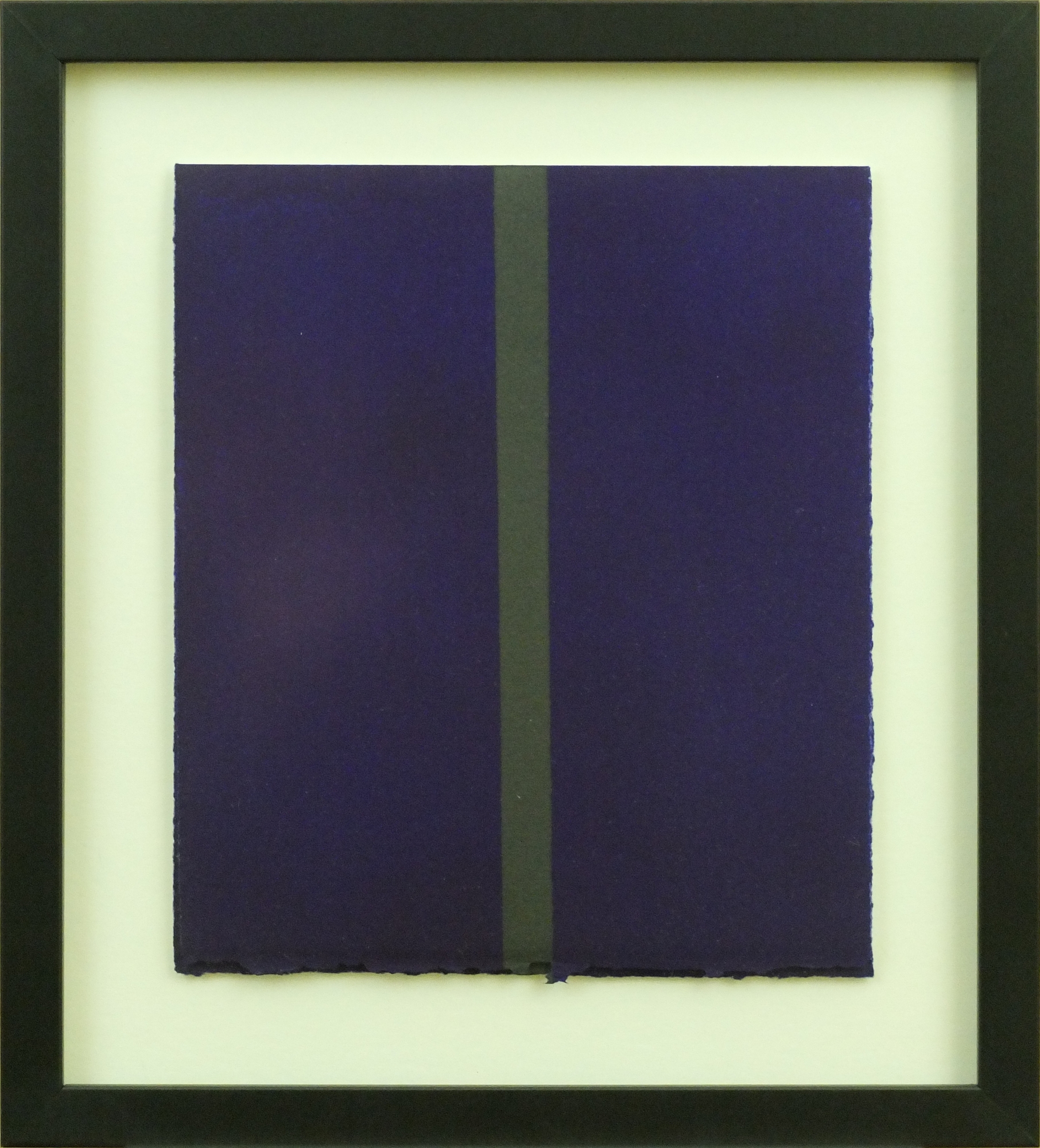
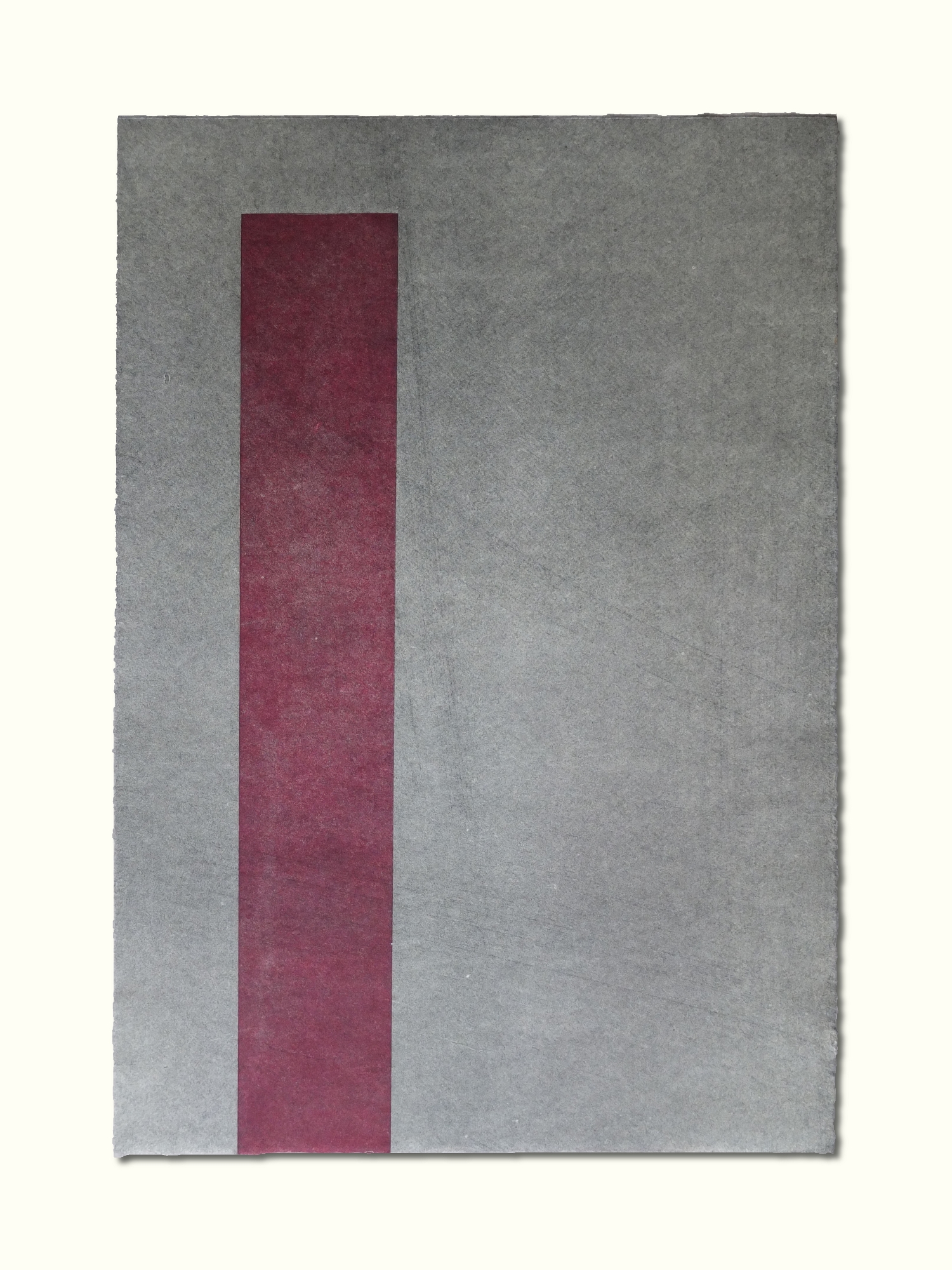
These are the works that Raphael describes as suggesting nothing but “abstraction, serenity, solitude, prayer”. The first one is a folding card, printed on very nice art stock.
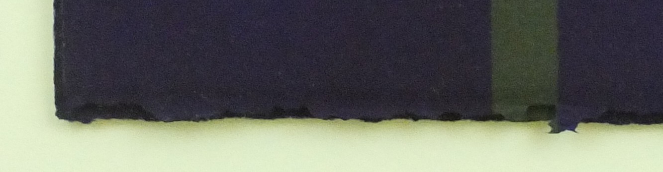
A side view shows the true nature of the work: a “sculpture-object”, as Raphael called it in an email comment, upon seeing this picture of the framing with the card slightly ajar.
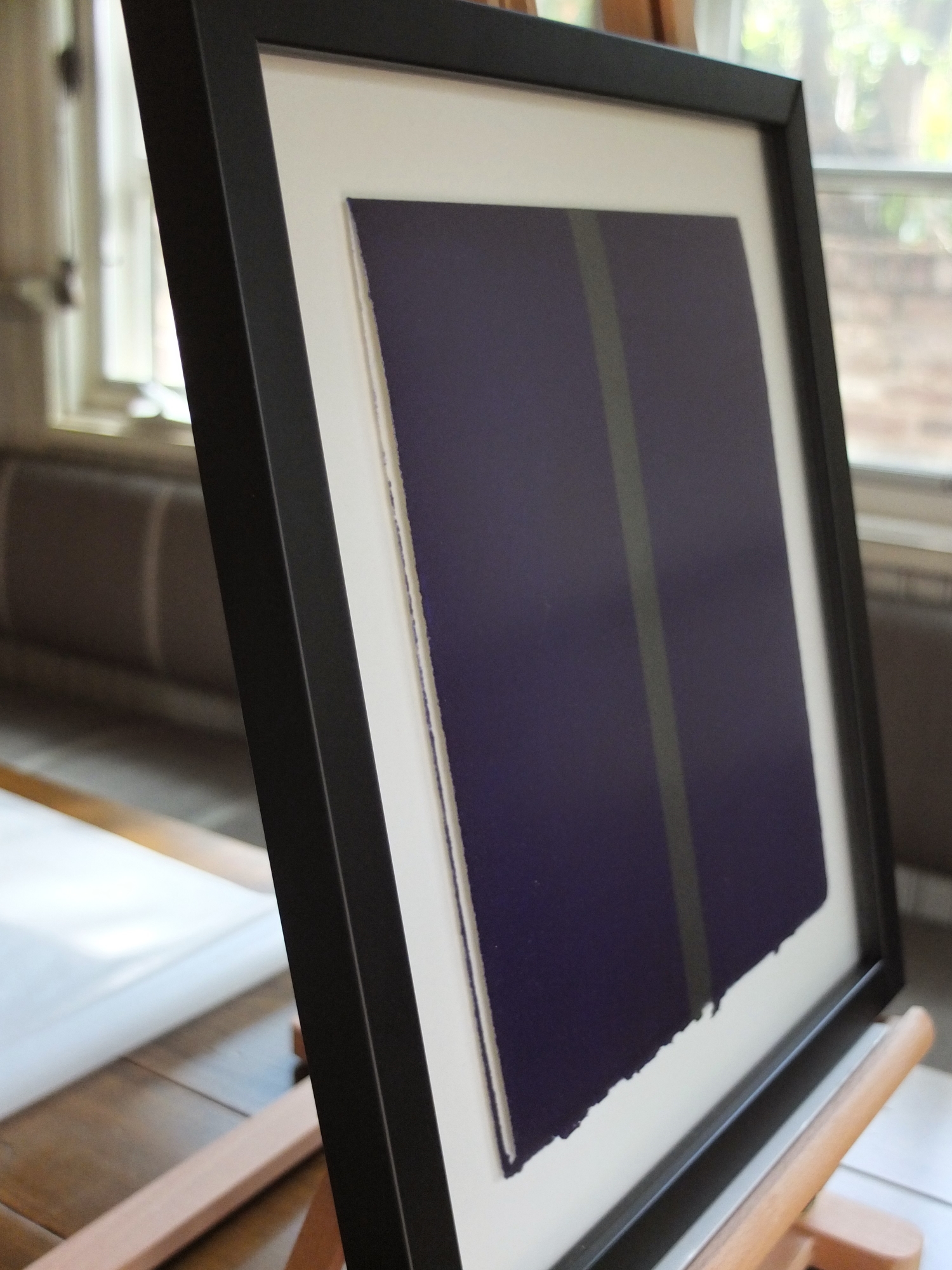
The frame guards the personal message inside, though it also teases by offering a scant glimpse. The colors are deep and lustrous, and the boundaries between them are crisp but not hard. Though it may seem in pictures that the blocks of color are homogenous and featureless, in real life, they express the subtle and regal textures in the paper, the complex geometries of the pebbly surface as well as the underlying fibrous nature. The latter is accentuated along the deckled edges. The work is at once serene and vibrant.
And here are two monoprints done on imperial Japanese paper (the blue one is owned by Celeste, the other one is mine). The paper is so fine as to be nearly translucent, yet it is able to be imbued with such confident tones. And, as with the purple monoprint card, the paper itself determines so much of the character of the works—how it holds the ink, how it reveals (or doesn’t reveal) artifacts from the plate and/or the printing process, and how it show its own essential nature and structure.
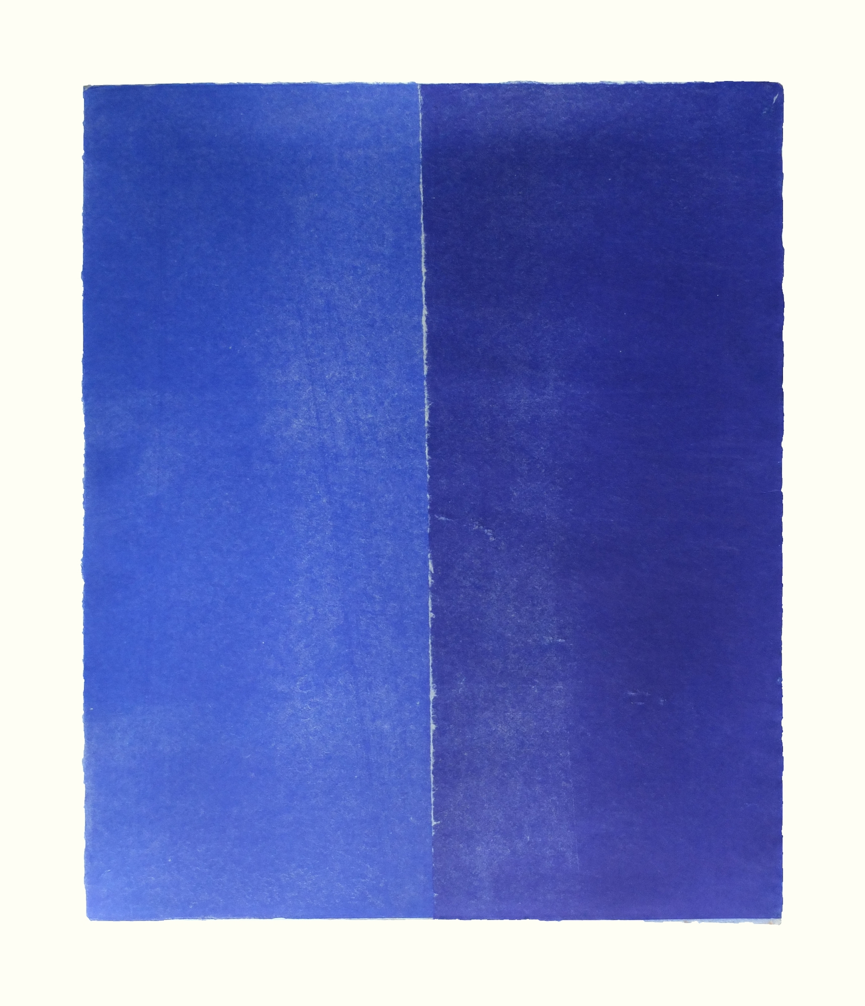
Note that these are both relatively large pieces (17.5 x 21 and 13.75 x 19.75 inches, respectively), almost impossibly large, it seems to me, for paper this fine and fragile. It’s hard to imagine how these works were achieved, yet here they are. They are exquisite. For these two prints in particular, pictures are completely unable to connote the feelings effected by the works. They must be seen, and contemplated, in person.
One more post to come on the printed works of Raphael Fodde (for the time being), then onto some works by Virginio Ferrari. Stay tuned.

Pingback: Customizing the Presentation | Lumina Capta